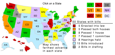
This graphic visualizes the progress of the National Popular Vote plan (more about the politics of this plan in Hacking the Constitution).
The existing visualization on National Popular Vote’s website was flawed enough to inspire this attempt at fixing it. They use a national map with states colored according to the plan’s progress. Using geographical visualization conflicts with the plan’s intention to make the states as entities less influential, and with the plan’s success depending on the number of electoral votes, not the geographical size or population of the states1. And even though the steps in passing the plan suggest a spectrum, the colors are seemingly random.
Plus NPV is a good cause that deserves more attention. And as a vocal Flash critic, I should put my money where my mouth is and implement a cross-browser, scalable, interactive, vector graphic to show that it can be done without Flash.
Visualizing complex data well is challenging, and this is no exception. The plan will likely be adopted slowly over many years, so the graphic must be designed to expand. The technology must also be future-proof; I don’t want to have to re-implement the graphic, convert it to a different format, or get access to future versions of software, or the operating systems that software must run on, just to keep supporting it. This pretty much rules out Flash and Sliverlight.
These constraints make SVG2 and JavaScript a good choice. SVG support is still nascent in Gecko and WebKit3 (and even Opera supports it), but the standard is pretty usable and I expect it to gain more adoption over time. All of the rendering code is in JavaScript. I’d put money on JavaScript interpreters remaining readily available ten years from now. I unfortunately have no ability (or desire, for that matter) to test this in IE with Adobe’s SVG plugin; if you try it, email me the results.
There are many different entities involved in the process: fifty states, each with two legislative bodies and a governor, and a total of 538 electoral votes; and many different events: passing the first body of a legislature, passing the second, bills passing the same body subsequent times, being signed into law, being vetoed, vetoes being overridden, and (hopefully never) laws being repealed.
The data comes from disparate sources; most comes from NPV’s website, but I had to search for the vetoes. The data is not just linear; it overlaps and interacts. A veto affects two of the charts but not the third, and a repeal would affect all three. The three charts have an order; a bill cannot pass both houses before it passes one, and cannot be signed into law before it passes both.
To include all this data, a visualization would either have to be interactive or poster-sized. This one is interactive; you can mouse over vertexes in the charts and get more information about the events they represent. You can quickly and easily find out:
- The exact progress of NPV at any time since its introduction.
- Who, what and where for any NPV-related event.
- All NPV-related events that have occurred in any particular state.
- How significant each state’s contribution to the electoral vote tally has been.
- Firsts, lasts, largests and smallests.
As with many real-world data visualizations, unexpected patterns emerge. Most activity is clustered in the winter, spring and early summer, when legislative bodies are in session. The only things that happen between August and December are vetoes. This cycle will likely become much more obvious once the graphic spans a few more years.
Hawaii’s legislature overrode their governor’s second veto, and The Governator has twice robbed the plan of California’s 55 electoral votes. Neither of these facts is obvious from the current graphic. If the plan is ever repealed, the graphic would need to show that too.
As I said in Hacking the Constitution, the the National Popular Vote plan deserves a lot more attention and support, so forward this page or NPV’s website to your friends, bring it up at parties, support it with a donation, or include the graphic on your web page.
- If a geographical design were used on a visualization of the progress of this plan, it should at least be a cartogram. [↩]
- The HTML
<canvas>element might also have been a viable option, but I already knew SVG. [↩] - For a good time, try resizing the font in Safari 3. [↩]