glyphobet • глыфобет • γλυφοβετ

musings over a tuna fish sandwich

Menu

Skip to content
  • essays
  • blurbs
  • travelog

A revised double-decker g for Apple’s San Francisco font

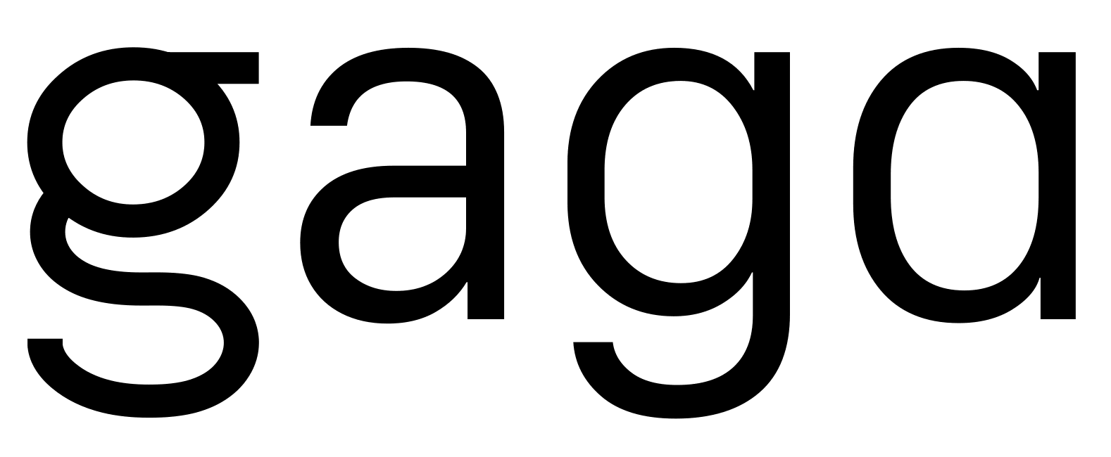
Based on some great feedback on Reddit regarding my revisions to Apple’s San Francisco font, I’ve revised my revised double-decker g:

gaga

As before, the original:

SanFrancisco-hamburgefons-Original

With a humanist a:

SanFrancisco-hamburgefons-Alternate-a

And with the new double-decker g:

SanFrancisco-hamburgefons-Alternate-g

And SVG versions: alternate a, alternate g, and an animated version over on tumblr.


This entry was posted in essay and tagged Apple, font, iOS, Mac OS X, OS X, San Francisco, typography on 4th July 2015 by admin.

Post navigation

← Drought Flag of California Better, Fewer, Shorter Meetings →

Pages

  • About
  • FAQ

Recent Posts

  • Monolithic repositories versus project repositories
  • Flag for the Chinese Language
  • The importance of good curves
  • Better, Fewer, Shorter Meetings
  • A revised double-decker g for Apple’s San Francisco font
Tweets by @glyphobet

Tags

Apple art CSS design distributed version control DVCS environment funny geography git google hacking HTML HTML templating image infographics internet internet culture JavaScript language law linguistics Linux Mac OS X maps math model-view-controller MVC orthography OS X politics programming Python Ruby San Francisco science science fiction security software typography Ubuntu user interface version control web design web programming

Meta

  • Log in
  • Entries RSS
  • Comments RSS
  • WordPress.org
Proudly powered by WordPress