Tag Archives: typography

Apple’s San Francisco font: adding double-decker g’s and humanist a’s

The letters "gaga" using both original and alternate a's and g's in Apple's San Francisco font.

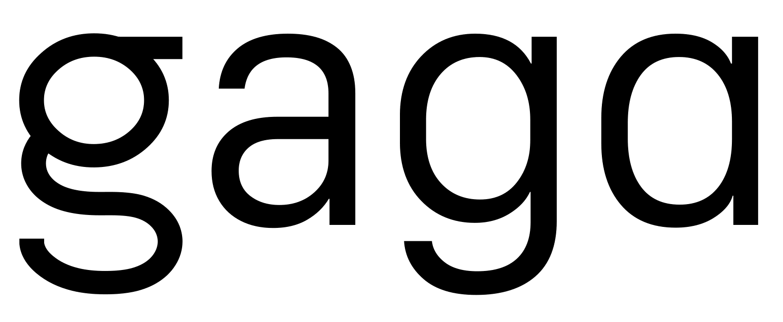
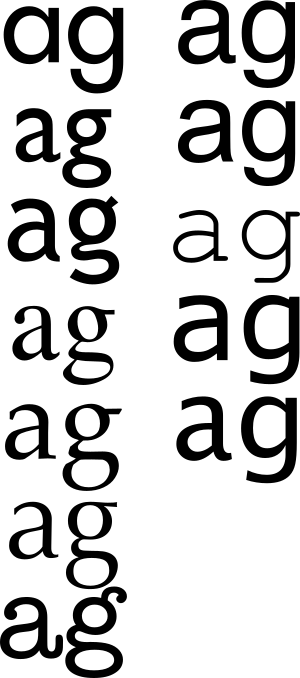
Apple’s new San Francisco font is going to be a vast improvement on Helvetica as a system font in iOS 9 and OS X 10.11. But it features a double-story a without a double-decker, looptail, or eyeglass g. It’s always seemed right to me for a font to have either both, or neither, of these special letters.

Turns out the font world disagrees with my intuition. Futura is the only one of my favorite fonts with a single-story a, and while Gill Sans, Trebuchet, Times, Palatino, Optima and American Typewriter all have both double-story as and double-decker gs (left side), Helvetica, Arial, Courier, Verdana, and Lucida Grande (right side) all have mixed double-story as with simple humanist gs.

The letters a and g in various popular fonts, showing the range of variation.

However, I still wanted to see a more Futura-like and a more Gill-Sans-like San Francisco, and although the font is only available at the moment to Apple developers, I was able to get a copy, and I’ve made alternate glyphs.

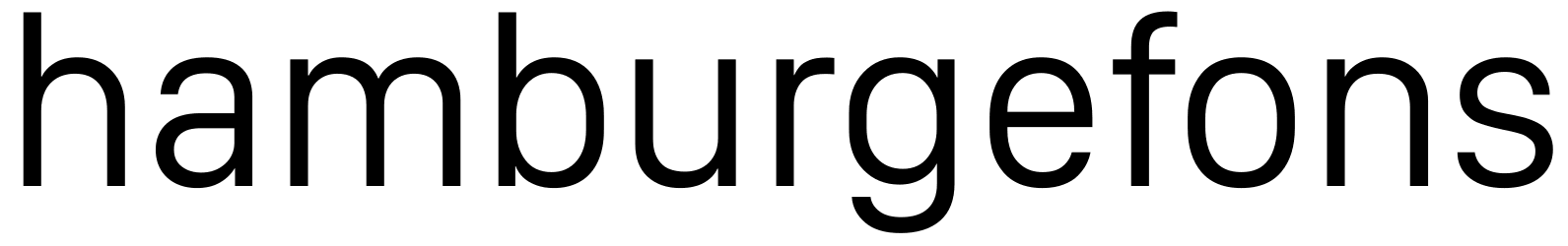
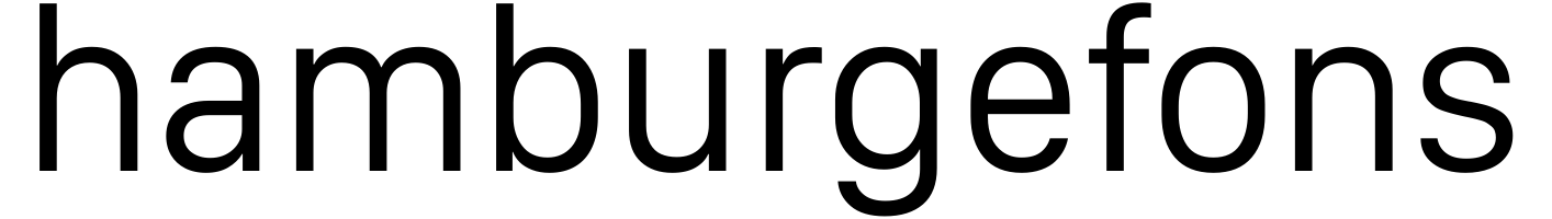
Here’s the original:

The word "hamburgefons" in Apple's San Francisco font.

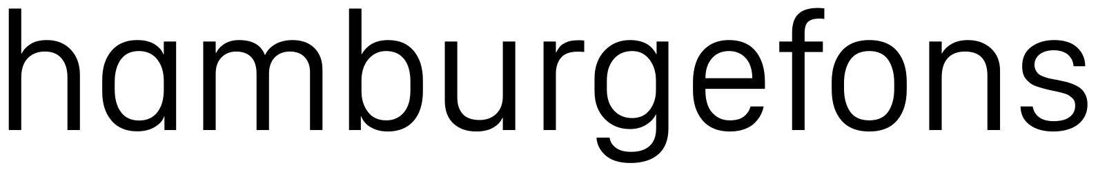
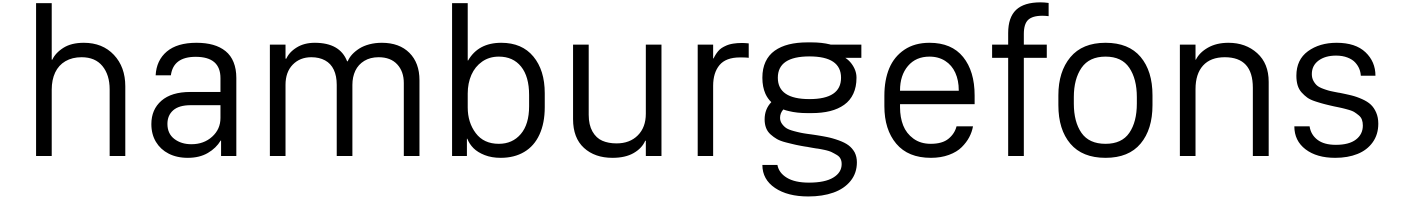
And here it is with a simple humanist a:

The word "hamburgefons" in Apple's San Francisco font, with an alternate humanist a.

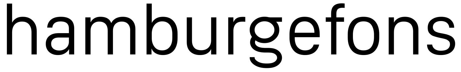
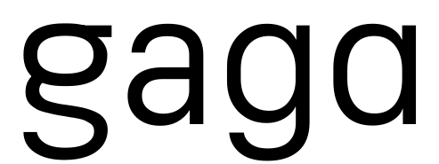
And here it is again with a double-decker g:

The word "hamburgefons" in Apple's San Francisco font, with an alternate double-decker g.

And just for fun, here are SVG versions of my alternate a and alternate g, and an animated version over on tumblr.

Update: I hereby release it all into the public domain. Apple, if you’re listening, feel free to incorporate one or the other of these into San Francisco.

“The alphabet remains”

Hermann Zapf, circa 1967:

Autocomposition, and computerized composition are already with us. Designing types and letters for the new technology will increasingly involve mathematics and the laws of electronics…. Tradition and progress must be logically united. Does the new technology mean the serious lettering artist will be dispensable? No. The alphabet remains. But we will have new tasks to learn. But in learning them, we must take time to observe the world around us, and remember above all the artist’s challenge: to ensure, despite technology and mass production, that beauty is never lost.

The Art of Hermann Zapf from Johnny Dib on Vimeo.

Fonts for sale!

After years of work and months of polishing, I’m happy to announce that five of my fonts are now available for purchase at MyFonts.com! Between now and March 10th, you can get any of these fonts for 30% by entering the promotion / gift certificate code BLOGMAR10 at checkout.

If anyone has any problems whatsoever ordering these fonts or getting the promotional discount, email me.