I’m going to print me up some of these:
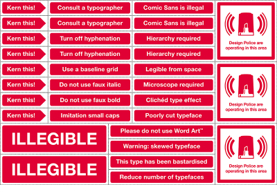
In other typographical news, this shit is fucking hilarious. But only if you are a giant typography nerd.
I’m going to print me up some of these:
In other typographical news, this shit is fucking hilarious. But only if you are a giant typography nerd.
Ars Technica would have you believe that the lack of facing pages in “e-book” gadgets like Amazon’s Kindle is the missing killer feature.
The solution to this problem is obvious and straightforward: design all e-book readers to display pairs of pages in the traditional, facing-page format in which books were designed to be read.
PottyMouth, my tool for transforming completely unstructured and untrusted text to valid, nice-looking, completely safe xHTML, is finally ready for its 1.0 release. I’ve added implicit list support, which was the last feature I wanted to hold up 1.0 for. Read about what PottyMouth is and what it does here. And if you know someone who’s building a website that might need it, tell them about it.
Embeddable fonts in webpages; we only had to wait nine years for a browser to implement this. Yet another reason to hold my breath for a WebKit browser on Xorg.
I’ve finally found the time to get the RoboFab libraries for Python working for me, and I’ve coded the core of the optical kerning algorithm that’s been rattling around in my head for a few years. My test input font consists of six characters meant to imitate A, V, H, O, t, X and a diamond shape. I was only expecting the algorithm to generate approximate kernings that would need to be tweaked by hand, but surprise, surprise; it’s almost perfect:
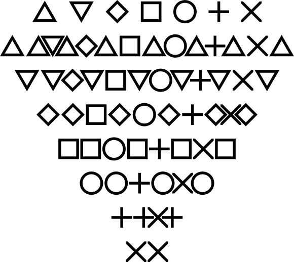
The only problem really is the tXt kerning, and that’s more an artifact of the too-regular, sans-serif shape of the glyphs.
The algorithm takes 1.7 2.6 seconds (wall time) to generate kern pairs for the 49 36 combinations of these seven six glyphs (including the time to read the font off disk, and convert it to UFO, and write that back to disk). That works out to faster than 0.036 0.072 seconds per glyph pair. Implementing the algorithm in C and caching the most common digraphs/kerning pairs might make it fast enough to use in a text-editing or layout program. (Struck out items are from before I added the diamond glyph and re-wrote some parts of the algorithm to be cleverer.)
Next step is to clean it up into a real application and run it on a full set of glyphs from a serif font, and compare the result with the font’s hand-kerning.
A good, fast optical kerning algorithm would even let you kern together different faces and different sizes. Wow, this is exciting.
Douglas Coupland in the New York Times with a particularly apt summary of a little typeface from Switzerland:
Helvetica essentially takes any word or phrase and pressure-washes it into sterility. I love it.
How can it be that a brilliant author loves a face that enforces such sterility? Granted, Helvetica fits better with the postmodern ennui of Coupland’s novels than with most other authors. But words are supposed to have personality and life; who wants to read a sterile novel?
Although I doubt I’ll ever agree with Helvetica’s many fans, I am beginning to see why they are fans. To many it is a face that evokes the comfortable modernity and consensus society of the second half of the twentieth century in the Western world. If you were brought up expecting the future to be the same, the grunge typography revolution initiated by digital typography would just be another reminder that your pressure-washed sterile future is lost forever.
I’ve always expected the future to be some dystopian hybrid of Zardoz, Six-String Samaurai, and Dark City. In that context, hanging on to Helvetica seems just nostalgia for an injected-plastic mold of the future, long past irrelevant.
I think I’ll go work some more on my deconstructivist typefaces now.
RoboFab looks interesting but unfortunately seems to be abandonware. The docs imply it should work under Unix, but nearly everything I try to do tracebacks with a message about GUI elements only working on MacOS or Windows. An email to the info address on their webpage bounced back undelivered after a few days. The wiki is busted, and the Google group lists three messages total, two of which are test messages. And the licensing situation is complicated, which would discourage me from contributing improvements to RoboFab or releasing any program I wrote using it. It’s not an initially inspiring project to get involved with, but I’m going to keep hacking, as there are a myriad font-creation tasks that could be partially or completely automated with something like RoboFab.
t.26 has two nice modern blackletter faces, Wexford Oakley and Nightjar, plus one just plain crazy face, Tonic In Gear.
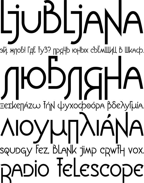
I’ve posted on Typophile work in progress on Ljubljana, a face I started working on in 2005 during my European trip which began in the city of the same name.
The Road To Clarity at The New York Times tells the interesting story of Clearview and Highway Gothic, the past and future faces of American road signs.
I’ve uploaded some more photos to my SF Typography project.
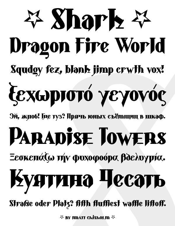
Here is a preview of Shark, a major revision to an old typeface of mine, on Typophile. The original version of Shark was done almost ten years ago as a hybrid between blackletter and roman, before I knew anything about blackletter. The revision has ligatures, alternate characters, upper and lowercase numerals, small caps, Cyrillic and Greek alphabets, and the kerning and metrics have been fixed.
Now you too can construct meaning out of color directly and unambiguously. If only we could come up with a font to convey the news fairly and balancedly.