The Road To Clarity at The New York Times tells the interesting story of Clearview and Highway Gothic, the past and future faces of American road signs.
I’ve uploaded some more photos to my SF Typography project.
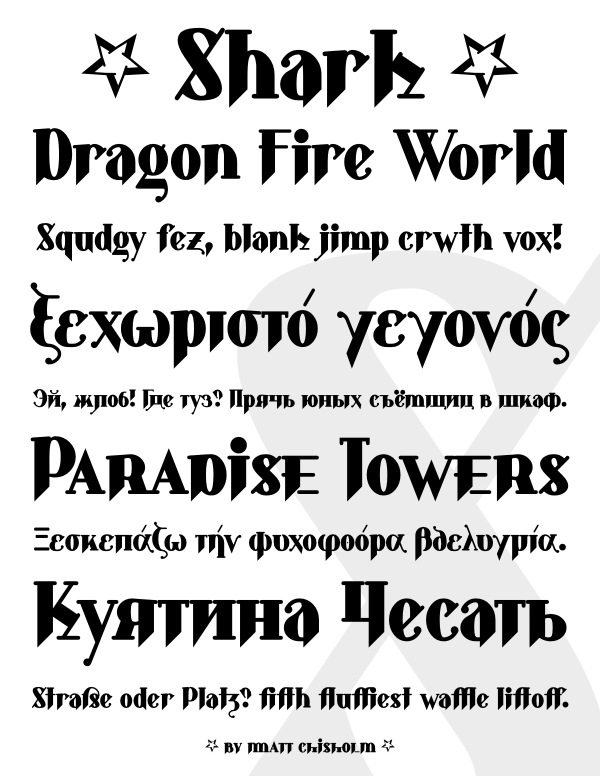
Here is a preview of Shark, a major revision to an old typeface of mine, on Typophile. The original version of Shark was done almost ten years ago as a hybrid between blackletter and roman, before I knew anything about blackletter. The revision has ligatures, alternate characters, upper and lowercase numerals, small caps, Cyrillic and Greek alphabets, and the kerning and metrics have been fixed.
