Tag Archives: site design

My identity is not for your profit

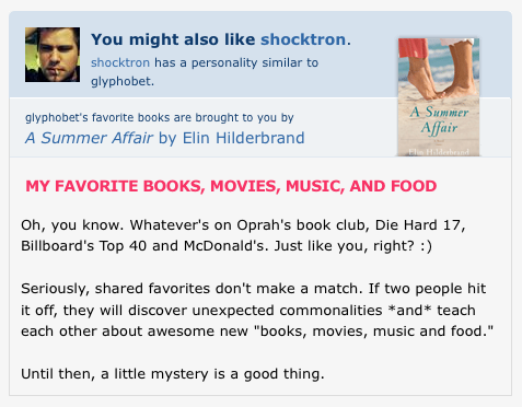
OkCupid is one of the best-designed websites out there. It’s addictive, captivating, easy to use, and pretty. But since it’s free and completely funded by advertising, the ultimate design goal of the site must be to get users to visit more pages, view more ads, and click on some. And this design goal can be taken to extremes that are at odds with the goal of providing quality matching. Consider this screenshot:
why-im-not-on-okcupid-anymore

This was from the unauthenticated view of my (now-disabled) OkCupid profile. The black text in the bottom half of this screen-shot was my somewhat snide response to OkCupid’s seventh-grade reading level getting-to-know-you question. And at the top is a plug for a different user and an ad for a book that has absolutely nothing to do with me or my tastes1.

The last thing that any OkCupid user should want is for readers to be distracted from their profile like this. And I really didn’t want some site co-opting my identity and interspersing advertisements and links to generate more page views into the middle of it. Even if it was to support a free site. So, OkCupid, you have joined the ranks of other online dating sites that just don’t cut it. Thanks, but no thanks.

  1. A Summer Affair‘s plot summary on Amazon makes it sound like an upscale romance novel with a helping of East Coast affluence-porn thrown in. []

It’s not you, babe. It’s not me either. It’s the website.

This is the story of a girl, a boy, and the website that came between them.

Many years ago now, I signed up for every online dating website I could find. I’ll spare you the list of excuses and protestations that I am actually capable of meeting girls in real life; all that matters is that I like to check out every website I can — because it’s my job, and because it’s interesting.

I once paid a little bit for what was, at the time, the best of the sites. To protect the icompeten– I mean, the innocent, I’ll just call this site www.meetsomeonenicetosettledownwith.com.

There’s a kind of paradox of profit in the online dating industry. To be a successfull company, you have to actually successfully connect people, which means they are no longer customers. Your customers are paying you — even if your site’s entirely ad-driven — to make them non-customers as quickly as possible. If there’s a clever way around this, I don’t know what it is.

Over the years, www.meetsomeonenicetosettledownwith.com got worse and worse. Although I initially paid for “credits” which could be used to send messages at any time, they converted to an exorbitant monthly fee system, and instituted a rigid caste system much like India had for centuries, with “Gold” (Desperate and loaded), “Silver” (Desperate or loaded, but not both), and “Standard” (Broke, sexually confused, deceased, or untouchable).

Continue reading