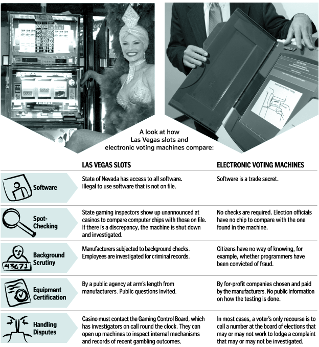
This is a pretty telling comparison between electronic gambling and electronic voting machines.

From The Washington Post via Schneier on Security.
This is a pretty telling comparison between electronic gambling and electronic voting machines.

From The Washington Post via Schneier on Security.
Flickr uses Where-On-Earth IDs to map percieved boundaries of neighborhoods and other regions — much like my Neighborhood Project does with Craigslist data, using Alpha shapes instead of blobbies — and raises the same questions about collective intelligence. (via Michael)
I’m always looking for clever t-shirt ideas, and ever since reading Alvin Toffler’s The Third Wave back in 1997, I’ve wanted to make my own custom t-shirts. I’ve made CafePress, Spreadshirt, and Zazzle stores for my own designs, plus a CafePress store for the Neighborhood Project, a Spreadshirt store for Mosuki, and a Zazzle store for my Burning Man camp. All three of these websites suck, in various ways.
RedBubble is the new kid on the custom t-shirt design block, and it kicks these three competitors to the curb1. I’ve moved all my designs there. To explain what they’re doing right, first I’ll explain what these three competitors are doing wrong.
CafePress is dog slow and riddled with quirks. Browsing through my private designs, a few of the product previews show up as broken images. Background images and UI graphics re-load on every page change, slowly. Designing a new product is a complex, multi-step process. First you choose blank apparel or household items and add them to your shop. Then dig through pages and pages of FAQs to find the exact DPI and pixel dimensions for the particular item. Then fire up your image editor and resize your graphic to match. Upload the image to your “media basket.” Then go find your blank item, and add the graphic to it. If you add a graphic of the wrong size — like putting the 200DPI version of your graphic designed for a coffee cup onto a 300 DPI t-shirt instead — there’s no warning and no visual feedback. You, or your customer, will just get a badly pixelated product. And worse, if you upload an image that’s too large — it will be badly down-sampled, and look almost as bad as an image that was too small. They added support for dark apparel at least as far back as 2006 — yet their product previews still don’t look right. This is basic image manipulation, not rocket science.
Spreadshirt has two different printing techniques. The better-quality one, “flock print,” can’t print designs that are too detailed, so they require you to wait several days for each design to be approved by a human at Spreadshirt. Like CafePress, creating a shirt involves first uploading a design, and then adding it to a product. Their shirt designer is a pure flash widget in a pop-up window which takes over a minute to load on my fast net connection and has all the standard Flash problems; high CPU usage, no keyboard navigation, no scroll wheel support, etc., etc. It has a bunch of controls and widgets, some of which I have never needed and others which I don’t understand. I ordered this shirt from Spreadshirt, after their customer service confirmed that the black in the image, around the diamond with rounded corners, would not be printed. The shirt had a salmon color in place of red — that’s #ff0000 red — and the design’s edges had been sloppily cut, totally ignoring the rounded corners. It was so hilariously bad that I didn’t bother asking for a replacement. Each shop even has a bunch of settings and fields, including “title,” and “shop name,” (only one of which actually appears inside your <title> tag — the other appears to be ignored), two different “description” fields (one of which also appears to be ignored) and the cryptic “Product choice-Display category type.”
Zazzle replicates the multi-step product creation process of CafePress and Spreadshirt. Their product design UI is, thankfully, AJAX and not Flash, and you can upload an image to your “gallery” inside the product design process, although it takes three clicks and about two minutes of waiting for the UI to load before you actually get to the HTML file upload widget. Like Spreadshirt, their product designer has a suite of widgets to position and transform your image, and it takes several clicks to get the final product up on your store. I’ve ordered three shirts from Zazzle – the first I sent back because it was printed at such low quality I assumed their printer was running out of juice. I was wrong; when I received the replacement, it was just a tad bit better. The second was a retro design; I was planning on the poor printing adding to the retro charm, and it did.
So what makes RedBubble so much better?
RedBubble’s print quality is superior. If all these sites are screwing it up so bad, full color, digital printing on fabric must be a really difficult problem, right? If it is, RedBubble has solved it. I bought two designs on RedBubble that were too good to pass up, despite the poor print quality I’d come to expect from design-your-own t-shirt sites. And guess what? The shirts look great — you have to look really close to see that they’re not actually silk-screened in five different colors.
Maybe designing t-shirts on the web is just a complicated, difficult process? Nope. RedBubble’s t-shirt design process is extremely simple and quick. You select a 2400×3200 image to upload, and click save, and you have a t-shirt ready for sale. What about positioning, scaling, adding text, and compositing multiple images, like you can do on these other sites? RedBubble doesn’t provide any on-site UI to help you do these things. And they shouldn’t. People who design t-shirts — especially the good designers — are using Photoshop, Illustrator (or GIMP & Inkscape) and their ilk, to begin with. Those programs are going to do a much better job at tweaking your image than some Flash or AJAX web app coded by that nerdy intern from last summer with a 250×250 product preview window and a bunch of buttons with icons your users haven’t seen before. Rather than maintaining their own inferior design and preview widget, RedBubble gets out of the user’s way.
In RedBubble’s shirt design process, you can also pick the default shirt type, the available colors, and the default colors, and add a title, description, and tags, but all those items are optional. You can design a t-shirt in three clicks.
The theme here is that RedBubble’s superiority is distinguished as much by things that it does better as by those it doesn’t waste time with. There’s no “store,” and no concept of multiple stores on a single account, just a bare-bones profile. There’s no site-wide marketplace in addition to your store. There’s no way to customize your product list’s colors, logos, or background. Custom layout is not necessary, since (unlike it’s competitors) RedBubble’s default site colors are clean, simple, and don’t detract from your designs.
RedBubble doesn’t let you make hats, sweatshirts, panties, aprons, mousepads, buttons, magnets, coffee mugs, dog t-shirts2, baby aprons, pet bowls, or light switch covers. Just t-shirts, posters, prints, and calendars. Their interface, and the underlying code, is vastly simpler because of this — there are no “choose product” or “add products to store” steps. And I bet t-shirts, posters, prints, and calendars make up a very large percentage — like 70% — of CafePress’, Spreadshirt’s, and Zazzle’s revenue. Doing less gets RedBubble to market quicker, gives them a simpler product, and makes them a more agile competitor.
RedBubble has also built a community, and channels to keep users on the site and bring them back. You can give people positive feedback for their work by “favoriting” it or by “watching” them. You get summary emails with new work by people you’re watching, comments related to your work, and so on, drawing users back to the site over time. I was overwhelmed when I got even one comment on the first design I posted. I’ve now got thirteen comments on sixteen designs; compared to just two comments on my entire Zazzle store. And the comments, favorites, tags, and watchlists mean there are more users and t-shirts on every page to click on, making their site almost annoyingly sticky.
There’s only one thing that RedBubble is missing. They need to let you print on the front and back of a shirt. And I bet they’re working on that.
RedBubble is following all of those pithy little maxims for building a successful website:
So long, CafePress! Farewell, Spreadshirt! See ya later, Zazzle! Me and my custom t-shirt designs will be hanging out over here on RedBubble from now on.
 This article and map of the “blogworld” has this to say about LiveJournal:
This blogging island is just barely in touch with the rest of the blogworld.
Them’s fightin’ words. You gonna take that lying down, LJ?
I got this email Tuesday from Joel Holdsworth, announcing that he had ported my Alphabet Soup pseudo-letter-generator from a bitmap to a vector model, and turned it into an Inkscape plug-in. He tells me that the extension will likely be included with Inkscape v0.47.
I cannot begin to express how phenomenally awesome this is. This is the kind of news that keeps me writing, and releasing, little free software projects. Six years ago I wrote Alphabet Soup as a little art project; it was fun. I released it under an open source license, and then never got around to improving it to output a vector format. Then somebody I’ve never met comes along, and not only improves it, but integrates it into a bigger free software project and it will soon be available to thousands of users in a greatly improved form.
You can pull the extension out of Inkscape’s SVN here. You’ll need these files:
share/extensions/render_alphabetsoup.inx
share/extensions/render_alphabetsoup.py
share/extensions/render_alphabetsoup_config.py
share/extensions/alphabet_soup/*.svg
Thanks Joel. Thanks Inkscape. I’m feeling pretty damn freetarded right now, and it feels good.
 Spydentify is a new experiment/side project of mine. It fills a niche that I first identified over at the Typophile Type ID Board: people love looking a pictures and trying to figure out what’s in them. The site’s interface is designed to be as addictive as possible, with a neverending, rapid flow of interesting images, big, shiny buttons to click, and instant feedback on your actions. I’m going to add more ego-stroking, viral-spreading and moderation features soon.
The interface also follows the MVC pattern I laid out in this article. It uses one static HTML file, all dynamic data is loaded through XMLHTTPRequest (AJAX, for those of you who speak Web 2.0), and all HTML generation is done via JavaScript manipulation of the DOM. The backend uses Pylons, which gave me a chance to learn Pylons, Paste, Routes, SQLAlchemy, FormEncode, and Mako. And comments are rendered with my own PottyMouth.
I also designed the logo all by myself.
Someone do me a favor and take a screen-shot of this and post it on Flickr, k thx.
Update 2007-Dec-10: Thanks Piper!
Update 2007-Dec-12: infinite flickr project
I wonder how long it will be before we see things like seam carving for content-aware image resizing in places like advertising, live video feeds, and various display technologies. And wouldn’t this be great for showing thumbnails in photo management tools?