Tag Archives: Greek

Orthographic Tourism

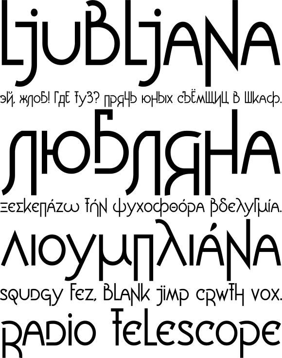
When visiting another country, the visual and typographic culture infects me. The types of lettering used, from stone names above hundred-year old buildings, to flashy billboard headlines, and the letter frequencies wildly diverging from English, conspire in my brain to generate a new typeface. Ljubljana and Breuckelen are both products of this process.

Part of the motivation for the varied destinations on this trip was to push this process in new directions. Even Greece, which I ended up skipping for various reasons, was chosen partly because they use yet another alphabet there. My typeface instigated by Chinese, Zenith, is little more than a gimmick, but it’s a good one. And then Turkey totally surprised me with a powerful, bold, high x-height, sans-serif face. Upon arriving in Hungary, I was suprised to find that the as-yet-untitled Turkish face fits here very well.

I’ll be digitizing these new faces when I get back.

Bulgaria, the first Cyrillic-using place that I’ve traveled, really threw me for a loop. After pages and pages of sketches, nothing has materialized yet, and it might never.

My fascination with Cyrillic is really a flip side of the East’s fascination with English, or even the West’s fascination with Chinese or Japanese tattoos. A different, mysterious set of symbols that can produce sounds in a person’s head, just like your alphabet can, is fascinating, at least until you learn it well enough for its operation to become unconscious.

Luckily there are more alphabets, and countries, to visit, and to learn.
Sunday evening typography: RoboFab, Ljubljana

RoboFab looks interesting but unfortunately seems to be abandonware. The docs imply it should work under Unix, but nearly everything I try to do tracebacks with a message about GUI elements only working on MacOS or Windows. An email to the info address on their webpage bounced back undelivered after a few days. The wiki is busted, and the Google group lists three messages total, two of which are test messages. And the licensing situation is complicated, which would discourage me from contributing improvements to RoboFab or releasing any program I wrote using it. It’s not an initially inspiring project to get involved with, but I’m going to keep hacking, as there are a myriad font-creation tasks that could be partially or completely automated with something like RoboFab.

t.26 has two nice modern blackletter faces, Wexford Oakley and Nightjar, plus one just plain crazy face, Tonic In Gear.

I’ve posted on Typophile work in progress on Ljubljana, a face I started working on in 2005 during my European trip which began in the city of the same name.

sample.png

Sunday afternoon typography

The Road To Clarity at The New York Times tells the interesting story of Clearview and Highway Gothic, the past and future faces of American road signs.

I’ve uploaded some more photos to my SF Typography project.

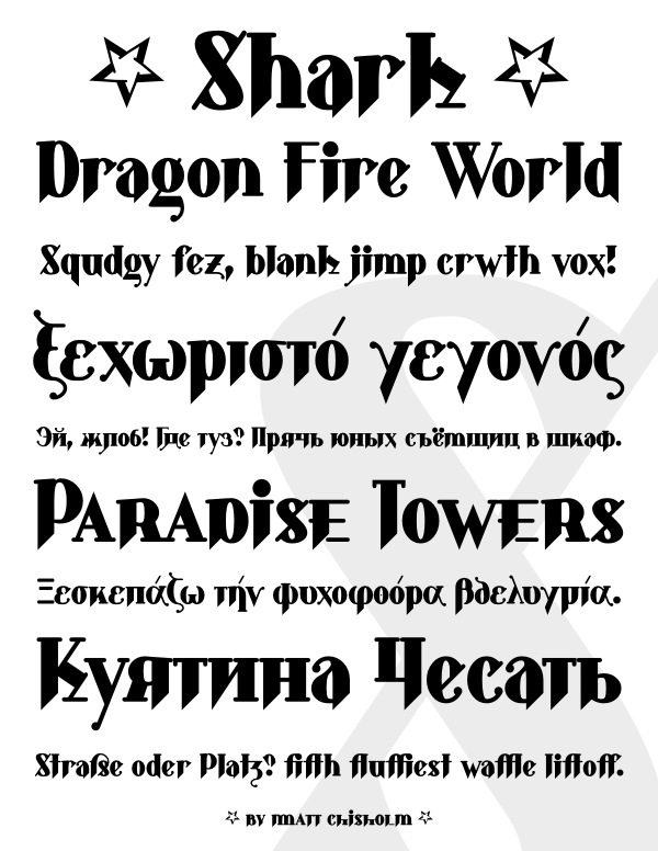
Here is a preview of Shark, a major revision to an old typeface of mine, on Typophile. The original version of Shark was done almost ten years ago as a hybrid between blackletter and roman, before I knew anything about blackletter. The revision has ligatures, alternate characters, upper and lowercase numerals, small caps, Cyrillic and Greek alphabets, and the kerning and metrics have been fixed.

sample2.png