This poster from Reporters Without Borders is exactly the message that the Bush administration needed to get a few years ago:

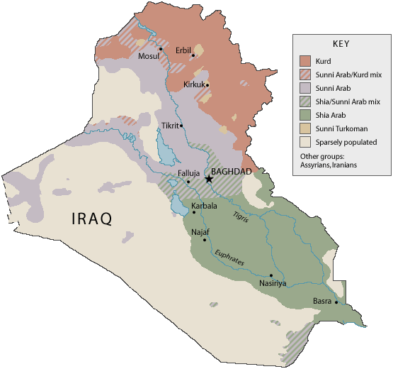
The colored regions even match the real Kurdish (white), Sunni (blue) and Shiite (red) regions pretty well:
This poster from Reporters Without Borders is exactly the message that the Bush administration needed to get a few years ago:
The colored regions even match the real Kurdish (white), Sunni (blue) and Shiite (red) regions pretty well:
There’s a huge trash field floating in the North Pacific gyre (E on the map):
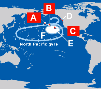
A segment on NPR about the same trash field noted that it does not show up on satellite photos because most plastic floats just under the surface of the water, where it is invisible unless you are close to the surface.
The Traveler IQ Challenge is a fun little game that tests your geographic knowledge. I can get to level 10, and sometimes level 11.
 StrangeMaps linked to a site with a very cool map of San Francisco neighborhoods. Unfortunately, it’s missing Dogpatch, Lower Haight, Japantown, The Tenderloin, Cole Valley, Russian Hill, Alamo Square, NOPA, Panhandle, and Duboce Triangle, and, if you want to get specific, Polk Gulch, South Park, and Pierre Valley too. I know because I’m keeping track. I wonder if the other maps for sale at Orkposters are similarly lacking.
The New York times has a neat interactive campaign finance map. The candidates would do well to study the following informative maps too.
Maps of War has mostly silly FOX “news” style infographics, but History of Religion and Imperial History are both great.
You can map all sorts of indicators of globalization at Gapminder.
The National Snow and Ice Data Center has a map of the arctic isotherm and treeline. Watch this real estate — it’ll be booming unless the next president (see first map) ratifies Kyoto and turns our ship of state around.
And CIO has a purty map of who owns the internet.
First, there’s Eddie Jabour’s Kick Map, an underground (literally) redesign of the New York City subway map, which has been rejected by the MTA. Too bad MTA doesn’t understand that the simplicity of Kick Map makes it vastly easier to read and use.
And then there’s Animals on the Underground, a modern-day version of the constellations which sees animals in the London Tube instead of the sky. People will see patterns everywhere.
And Driving Orientation: A World Map, shows that although most people in the world drive on the right, and many countries are following suit (only Namibia has bucked the trend by recently switching to the left), there are still many border crossings where you might need to make a quick mental adjustment after you get your passport stamped.
I guess there’s something to be said for standardization.
This Transit Map of the World’s Transit System, a promotional poster for Transit Maps of the World (amazon) by Mark Ovenden, discovered over at my new favorite blog, Strange Maps, cleverly shows all of the cities in the world with rail transit systems connected in the style, and the layout, of the London Tube.
Strange Maps has great stuff, most of which I’ve seen before. The classic Newyorkistan, pretty The Colourful Side of the Moon, The Blonde Map of Europe for those gentlemen who allege a preference, the disturbing Europe, If the Nazis Had Won, Chris Yates’ A Diagram of the Eisenhower Interstate System, C. Etzel Pearcy’s The Thirty-eight States of America, and XKCD’s Online Communities Map.
They should link to my Seeing stars post about the historical designs of Moscow transit maps. And they don’t yet have The Great Bear, the Rude Map, or the Convenience Map.
I also stumbled across a reference to The Tunnel, a 1935 science-fiction film about the construction of a tunnel from New York to London. The Tunnel joins Cargo 200/Груз 200 and the short film Microgravity on my list of films not available on Netflix.
So there you have it. The internet’s not done yet. There are still some things not organized, categorized, or digitized.
This is an updated version of my Seeing Stars post on more.theory.org back in August 2004.
A comment Jon made about the Moscow Metro maps prompted me to google about for some pictures. I found this page, a comprehensive archive of Moscow subway maps going back to 1935. Since I’m a graphic design junkie, I checked them out. And I noticed something interesting. When the orange and purple lines were completed in 1973 or 1974, the map suddenly changed from a seemingly random jumble of lines to a distinct star pattern.
Now, subway maps are almost always abstractions. In fact, things are better that way; the configuration of stations with respect to each other is the important detail; the actual distances between stations, and the curved or straight nature of the actual tracks, is prettty irrelevant. When a city map is overlaid with its subway map, the result is often unrecognizable.
But when the purple and orange lines were completed, they went from being angled to completely straight, and the crossing point of the orange and purple lines was moved above the blue line. These modifications made the map into a star within a circle pattern.
The star disappears in 1984 with the introduction of two new (grey and yellow) lines.
The star in the circle was an important soviet emblem. It seems most likely that the similarity was just the bright idea of some clever designer. I wonder how obvious it was to the people of Moscow, when the star maps came and went. And I wonder what subtle symbols are present in our own visual culture.
An example is the down-pointed triangles that can be seen in many of the graphics on the San Francisco MUNI buses and trains, which is historically a gay-rights symbol. Look for it next time you’re on public transit in the city. What would it mean to you if it vanished one day? (Update: Since originally writing this post in 2004, the triangles have become much less prominent on Muni’s website.)
What must the Muscovites have thought when the new maps, without stars, came out?
ps. this is the coolest of the Moscow subway maps (look for Line #9).