Category Archives: essay

Essays

A two-step refactoring tactic

In the middle of a major, hairy refactoring recently, I codified a tactic for refactoring that I’d been using, unconsciously, for years. The tactic is to break down refactoring into two modes, and deliberately switch between them:

  • Clean-up mode: Clean up and reorganize the code, without changing the code’s external functionality.
  • Change mode: Make the smallest, simplest self-contained change, making sure the code is functional again when it’s completed.

You start in clean-up mode, and switch back and forth as needed. This tactic is probably unsurprising to experienced programmers, but for those of you not yet as hard-core as Donald Knuth, let me explain why it’s a good idea.

Separating clean-up and changes into discrete modes of working gives you less to think about at any one time. A refactor can be very invasive—code that was closely tied together is now completely decoupled, or vice-versa; functions, objects and modules become obsolete or nonsensical, or split apart or merge in unexpected ways; identifiers become ambiguous or collide. If you’re trying to reorganize everything at the same time you’re juggling old and new code in your head, it’s easy (for anyone) to get lost in the maze.

When you’re consciously in clean-up mode, you can focus just on tasks like making sure variables have unambiguous, correct names, object / module / function / &c. organization and boundaries are sensible, and so on. You’re not changing any functionality, so your tests (you do have tests, right?) still pass, and the application still behaves as it always has (you did test it manually, right?). And you can be liberal in your clean-up; if you end up improving code that isn’t ultimately affected by the refactor, there’s no harm in that.

Once you feel like the code is clean and ready for the changes in functionality, commit your clean-up (you are using version control, right?). I usually use a commit message like “clean-up in preparation for….”

Now switch to change mode, and start making the changes. Quite often, you’ll discover something else that needs to be cleaned up. But you’re in change mode, not clean-up mode. Since you’re only making the smallest, simplest self-contained change, this new clean-up can probably wait until later. But if it can’t wait until later, then roll back your changes (or save a patch, or store your work in the attic, or the stash, or shelve it, or whatever the kids are calling it these days). Complete the new clean-up, commit it, and then go back to change mode and your half-completed changes.

This tactic has some additional benefits that might not be immediately obvious, too:

  • Clean-up mode forces you to read over all of the code that’s going to be changed and ask, “How is this code going to be affected by the changes I’m planning?” Sometimes you discover unanticipated edge-cases or bugs in your planned changes. Sometimes you realize the whole plan is flawed, and have to go back to the drawing board. And sometimes, after a good, hearty clean-up session, you realize that you can make the required changes in a less invasive, simpler way. I find that most refactors are more clean-up than anything else.
  • If the codebase has a “master” or “main” branch, and you use a “feature” or “working” branch for your refactor, you can put the clean-up commits into the master branch (they don’t change any functionality, right?) and only commit the functional changes to the feature branch. What’s the point of that? Well, everyone else gets to benefit from your code clean-up right away, and when you do end up merging your functionality changes into the master branch, because it’s a smaller delta, there’s a smaller chance of conflicts.

The next time you’re staring down the barrel of a nasty refactor, and cursing the person who didn’t fully think think through the business requirements, try this. It won’t make every refactor a piece of cake, nor will it become the hot new programming methodology acronym down in the valley (2SR, anyone? 2SRT?), but I guarantee you’ll be glad you tried it.

Grasping the nuclear fourth rail of Python syntax with both hands and holding on for dear life

In Python vs. Ruby: A Battle to The DeathGary Bernhardt wishes for Ruby-style blocks in Python.

The BDFL has already weighed in on anonymous blocks in Python:

If you want anonymous blocks, by all means use Ruby. Python has first-class callables,1 Ruby has anonymous blocks. Pick your favorite, but don’t whine that neither language has both. It ain’t gonna happen.

This seems to imply that first-class callables and anonymous blocks are mutually exclusive language features, but that’s wrong: JavaScript has the ability to pass callables around like anything else, and it has anonymous functions, which can be used just like Ruby’s anonymous blocks. Does that mean JavaScript is better than Python or Ruby? My feelings about Ruby are indifferent with a chance of rain, but I love Python, so I’ve got to ask: are you going to take this lying down, Python?

I’m not sure Python needs full-blown, Ruby-style anonymous blocks. But it might be good enough to be able to use function definitions as r-values, like JavaScript can. (If you’re not already wearing your tinfoil hat, now might be a good time to put it on.)

This would allow asynchronous code to be written in conceptual order (just like in JavaScript):

do_something_asynchronous(param1, param2, (def callback(result):
    do_something_with_result(result)
))

And it would allow encapsulation of lexical scope inside specific iterations of a loop to be used later when an asynchronous call returns (just like in JavaScript):

for item in results:
    (def single_iteration():
        do_something_asynchronous(param1, item, (def callback(result):
            do_something_with_result_and_item(item, result)
        ))
    )(item)

I’ve even had occasion to want that other Python namespace, class, to operate as an r-value:

class MyConverterClass(BaseConverterClass):
    my_converter_type = (class MyConverterType(float):
        def __str__(self): # a custom __str__ method
            return '%0.2f' % self
    )

In these examples I’ve wrapped their inline definitions in Python’s great syntactical equalizer, the parenthesis. It would be even nicer to be able to leave them off, but I’m sure that this syntax would run headlong into Python’s whitespace-based block definitions, and it would be even more of a train-wreck without parentheses.

I’ve also named the defs and classes. It would also be nice to be able to omit the function or class names if they were unneeded (just like in JavaScript). But anonymous functions, a.k.a. lambdas, are the electric third rail of Python syntax, so anonymous classes would be… I dunno, the nuclear fourth rail?

  1. Thanks to Steve for explaining that by “first-class callable,” GvR means functions that can be passed around and assigned to other variables without being executed. He also pointed out that the reason Ruby’s callables aren’t first-class is because optional parentheses in function calls leave no way to refer to a function without calling it, not because of the existence of anonymous blocks. []

Seen any good tables lately?

The periodic table fad has gone meta, not only with The Periodic Table Table at (Wake Forest University, in North Carolina):

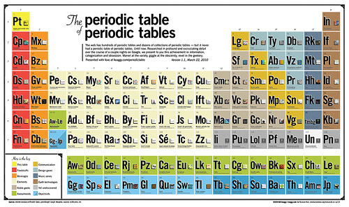
But also with this periodic table of periodic tables1 by keaggy.com:

Before the Periodic Table of the Elements, elements were a chaotic collection of substances with seemingly random and unpredictable masses, melting and boiling points, electrical, chemical, and material properties, and so on. Not only did the periodic table organize the known elements in a way that explained these properties, but it correctly predicted the existence and the properties of undiscovered elements.

All these parodies of periodic tables2 are only funny because this tendency towards scientific organization has totally permeated popular culture. And that’s pretty encouraging.

  1. For those of you who hate your web browser and want it to crash, there’s also a version of the Periodic Table of Periodic Tables that uses an off-the-shelf Flash app and 217% of your CPU to make a zoomable interface that could be done in about ten lines of CSS & JavaScript, and 0% of your CPU. []
  2. My very own Periodic Table of the Europeans is at “Eu,” (number 63), smack dab in the middle of the “Awesomeoids” (the green row). Thanks, keaggy. []

Announcing FlakeNot

For the last few months, Ross and I have been working on FlakeNot.

FlakeNot keeps track of all your invitations in a single place. To sign up, forward pretty much any email with a date and a time in it to new-event@flakenot.com. FlakeNot will create an account for you and remember all the events you send it.

Once you’ve forwarded some events, send email to calendar@flakenot.com and you’ll get an email with your upcoming events. And visit flakenot.com to see your calendar on the web.

That’s it. No fancy logo. No social network, no profile photo. No Flash applet. No Google Maps mash-up. No video chatting with random strangers. Just a quick, simple way to keep track of all your invitations, so you can get out there in the real world and spend time with your real friends.

Yes, it works with Evites and Facebook invites. Yes, there’s a version of the site optimized for your Android/iPhone/Palm Pre. Yes, we plan to support Google calendar, write a Facebook application, and integrate with iCal. Yes, yes, yes.

A surprising interface

This quote from an ex-Apple employee about the rumored Apple tablet has got me thinking:

You will be very surprised how you interact with the new tablet.

What could this mean? There are not many interfaces that would be “very surprising.”

A virtual laser keyboard would be surprising. But like a real keyboard, those keyboards aren’t very mobile; they require a flat surface, which you normally don’t have on the move. And a virtual keyboard doesn’t really seem like Apple’s style.

Voice control, or at least good speech recognition to complement keyboard input, is also a serious possibility. It’s something Apple has been interested in for a long time (via DF). A world where airports, subways and coffee shops are filled with people dictating emails and blog posts to their mobile devices is a little terrifying, but then again we already live in a world where people are have intimate personal conversations on their mobile phones in public.

A significantly expanded set of multi-touch gestures is the most likely. Taking advantage of the larger surface of a tablet screen to allow two-handed gestures seems like a natural choice. And handwriting detection would actually not be that much of a surprise from the company that brought us the Newton. Both of these are hinted at in recent patent filings.

While the article I link to in the previous paragraph compares Apple’s patent to the interface in Minority Report, the interface that article talks about requires the user’s fingers to be touching a surface, not in the air. A true Minority Report-style interface, where you gesture in the air to control the device, would be quite surprising. Being able to control a device without actually touching the screen (and getting finger marks on it) would make the tablet more attractive for full-screen uses like watching movies and playing games. This interface is a ways off still, though.

Ten ways to build an unmaintainable web application

Old-school hackers had a long tradition of ensuring job security by building applications so unmaintainable that only the original authors could work on them. But in these days of web applications, unmaintainability has fallen by the wayside. Instead, design fads like CRUD, REST, MVC, DRY, and KISS, have eliminated the average programmer’s job security.

Here are ten quick tips for achieving maximum unmaintainability in your web application. Following them will ensure that, in thirty years, a web programmer like you will be as valuable as a fifty-eight year old COBOL programmer contracting at $200/hr for a Fortune 500 company that still hasn’t migrated off of PL/1. You too will be able to live on a dairy farm in Pennsylvania, grow a beard down to your navel, and work in your underwear. And you’ll never have to learn anything new, work with anyone else, or start another new project.

  1. Mix it up. Put some JavaScript into external files, but be sure to intersperse JavaScript into your HTML, some of it in <script> tags. Cram multiple JavaScript statements into onclick and other event attributes — the longer, the better. Do the same with CSS; put some into external files, some in <style> tags, and also put some critical CSS into complex style attributes. And remember to put most of your <script> and <style> tags in the middle of the page content, instead of in the <head>, so that they will be difficult to find.
  2. Make everything dynamic. Generate JavaScript and CSS in your HTML templates. Think of it as another type of eval. Generate HTML server-side using templates and browser-side using JavaScript. What’s harder than working around a obscure IE layout bug with weird markup tweaks? Making sure both your server templates and your JavaScript HTML generation work around the same bug with the same HTML black magic.
  3. Abstraction, Shmabstraction. Pass lots of data from the server to the browser, store it in hidden form fields in the page, and then pass it back, unchanged, when submitting the form. That way, when the back-end data model changes, you get to rewrite part of the interface too. Allow data-model or server implementation details to creep into the interface implementation. Is the database sharded? Is the cache dirty? Does this row use a composite key? No need to have the server abstract these details, just pass that information to the JavaScript and let it sort everything out. That way, a sysadmin or a DBA can break the UI just as easily as a web designer can.
  4. Keep your data unstructured. Make sure all communication between the browser and the server is just a flat list of key/value parameters. Some of your parameters will be data to store, others will be modes or flags that affect the behavior of the service you’re hitting, and still others will be modifiers to display messages or affect the behavior of the UI. Keeping your data unstructured ensures these different types of parameters will collide. Often.
  5. Commit to a platform. Don’t waste your time checking to see if your pages work in all browsers (at least not until you’re totally done). Better yet, develop only in a single browser and don’t even bother to find out whether the features you’re relying on even exist in other browsers. Nothing is more fragile than an application that’s tightly tied to a single platform.
  6. Trust the browser. Rely soley on JavaScript input checking for some data — don’t check input on the server-side. Store sensitive data in hidden form fields. Put authorization checks in the JavaScript rather than on the server. Parameters like authorized=1 just scream out for URL hacking, and storing them in hidden form fields is only slightly harder to hack.
  7. Trust the server. Rely soley on the server to check, store, and generate only valid data in some places. That way, a DBA can change a single column constraint or data-type, and parts of the UI start to fail.
  8. Don’t use DOCTYPEs. That way you’ll never be sure what rendering mode different browsers are going to use to render your content.
  9. Ignore the cascade. Don’t bother to understand what the C in CSS stands for.  Just keep overriding styles until a page element looks the way you want. That way, your styles will be fragile and will break unexpectedly when an intern changes something a reasonable person would expect to be unrelated.
  10. Don’t use classes or ids. Instead, always write JavaScript and CSS that finds nodes based on tag name, name, alt or title attributes, or by their position in the DOM. That way when anything in the page changes, the hierarchy, the attributes, or when the site is translated into another language, things break. If you do end up using class or id, be sure to make a separate class for every node in your document and assign the same id to several different nodes.

If, however, you want to write flexible code that can react to and evolve with the ever-changing needs of its users, even after you have left the project in the hands of a clever but inexperienced hacker, you should probably avoid these techniques, and read up on some of those lame new design fads instead.

Special thanks to all the programmers whose code has illuminated these techniques over the years. My job may not be as secure as yours, but at least my code, and my conscience, are clear.

Some impossible objects before breakfast

Lately I’ve been playing with rapid prototyping, also known as three-dimensional printing. It’s a (relatively) new fabrication method that allows creation of shapes that would be impossible to create by moulding. It allows for creation of things like interlinked rings, objects trapped inside other objects, or complex voids.

Shapeways, a Netherlands-based website, offers high-quality, relatively cheap rapid prototyping, and a place to host your own selection of models. As a website, Shapeways is no RedBubble — the interface and marketplace tools leave much to be desired. The ratings and sorting can be gamed, it’s trivial to figure out the markup on another user’s model from its price, there’s no way to replace a published model with an improved one, and the site has encoding and markup issues. But what’s a few flaws when you own the category?

The free version of Google SketchUp has been satisfactory for rendering thus far, and its user interface is leaps and bounds ahead of the bizarre interface of Blender. I’m sure Blender has a superior feature set, but what good is power when you can’t figure out how to use it? Meshlab and AccuTrans3d have both come in handy for checking surfaces and converting between formats.

On to the models! Click on the pictures to see more views of each.

Trapped Outside

Trapped Outside is a model of Boy’s Surface with a sphere trapped in the space cut out by the one-sided surface. Boy’s Surface an immersion of the projective plane, which means it is a Möbius strip with a disk glued to its edge. It is a non-orientable surface with no edges and no pinch points.

Trapped Outside

Trapped Outside was fairly easy to create using Google SketchUp. It’s just a few circles extruded along each other here and there.

Hollow Knotted Gear

The Hollow Knotted Gear, inspired by Oskar van Deventer‘s Knotted Gear, consists of two interlinked knots; a trefoil knot (in green) and its dual, a 3,2 torus knot. The green trefoil forms a rectangular cross section and a triangular hole. The blue knot forms a triangular cross section and a rectangular hole. The two knots gear perfectly together, and can move around each other, but only if they are both moved simultaneously.

Hollow Knotted Gear

After many failed attempts at getting various applications to render this complex extrusion properly, I wrote a small Python program to calculate the surface for me and output VRML. Then, after much more trial and error, I used AccuTrans3d via Wine to convert the VRML surface to a DAE file for uploading to Shapeways, and to a 3DS file for examining in Google Sketchup (and to take screenshots).

There are a few more of my designs on Shapeways right now, and even more rattling around in my head just waiting to be prototyped.

A tiny fix to the jQuery hint plugin

Here’s a tiny fix to Remy Sharp‘s excellent jQuery Text box hints plug-in. Without this fix, jQuery‘s val function will return the hint text if the text box hasn’t been filled out by the user yet.

Here’s the patch:

@@ -20,7 +23,7 @@
       $win = $(window);

     function remove() {
-      if ($input.val() === title && $input.hasClass(blurClass)) {
+      if ($input.realval() === title && $input.hasClass(blurClass)) {
         $input.val('').removeClass(blurClass);
       }
     }
@@ -41,4 +44,17 @@
   });
 };

+
+$.fn.realval = $.fn.val;
+
+$.fn.val = function (value) {
+  var i = $(this);
+  if (value === undefined) {
+    return (i.realval() === i.attr('title')) ? '' : i.realval();
+  } else {
+    return i.realval(value);
+  }
+}
+
+
 })(jQuery);

And here’s the full plugin with the patch applied:

/**
* @author Remy Sharp
* @url http://remysharp.com/2007/01/25/jquery-tutorial-text-box-hints/
*
* better val() method added by Matt Chisholm, 2009/07/27
* http://glyphobet.net/blog/essay/878
*/

(function ($) {

$.fn.hint = function (blurClass) {
  if (!blurClass) {
    blurClass = 'blur';
  }

  return this.each(function () {
    // get jQuery version of 'this'
    var $input = $(this),

    // capture the rest of the variable to allow for reuse
      title = $input.attr('title'),
      $form = $(this.form),
      $win = $(window);

    function remove() {
      if ($input.realval() === title && $input.hasClass(blurClass)) {
        $input.val('').removeClass(blurClass);
      }
    }

    // only apply logic if the element has the attribute
    if (title) {
      // on blur, set value to title attr if text is blank
      $input.blur(function () {
        if (this.value === '') {
          $input.val(title).addClass(blurClass);
        }
      }).focus(remove).blur(); // now change all inputs to title

      // clear the pre-defined text when form is submitted
      $form.submit(remove);
      $win.unload(remove); // handles Firefox's autocomplete
    }
  });
};

$.fn.realval = $.fn.val;

$.fn.val = function (value) {
  var i = $(this);
  if (value === undefined) {
    return (i.realval() === i.attr('title')) ? '' : i.realval();
  } else {
    return i.realval(value);
  }
}

})(jQuery);

My identity is not for your profit

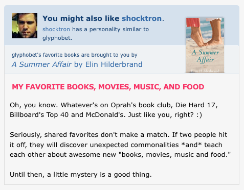
OkCupid is one of the best-designed websites out there. It’s addictive, captivating, easy to use, and pretty. But since it’s free and completely funded by advertising, the ultimate design goal of the site must be to get users to visit more pages, view more ads, and click on some. And this design goal can be taken to extremes that are at odds with the goal of providing quality matching. Consider this screenshot:

why-im-not-on-okcupid-anymore

This was from the unauthenticated view of my (now-disabled) OkCupid profile. The black text in the bottom half of this screen-shot was my somewhat snide response to OkCupid’s seventh-grade reading level getting-to-know-you question. And at the top is a plug for a different user and an ad for a book that has absolutely nothing to do with me or my tastes1.

The last thing that any OkCupid user should want is for readers to be distracted from their profile like this. And I really didn’t want some site co-opting my identity and interspersing advertisements and links to generate more page views into the middle of it. Even if it was to support a free site. So, OkCupid, you have joined the ranks of other online dating sites that just don’t cut it. Thanks, but no thanks.

  1. A Summer Affair‘s plot summary on Amazon makes it sound like an upscale romance novel with a helping of East Coast affluence-porn thrown in. []