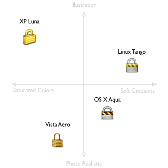
Alex Faaborg‘s post about the new Firefox icons includes this curious typology of modern icon styles. I wasn’t aware that “saturated colors” was the opposite of “soft gradients:”
I’d love to see Windows 3.1, Mac Classic, and all the other icon styles from OS-es past, on this chart.